Etsy conversion rate is one of those stats that makes you feel like a genius on Monday and an idiot by Thursday.
Because you can do a bunch of work, get more views, even get more favorites, and still… the sales don’t move. Or they move a little, then stop. And you start second guessing everything. The price. The photos. The tags. The font you used. The fact that you dared to use the word “minimalist” in 2026.
Anyway. Here’s the truth I wish someone said to me early on.
Most Etsy conversion problems are listing problems. Not traffic problems.
Yes, traffic matters. But if 200 people see your product and nobody buys, your issue is not “I need more views”. Your issue is the page.
So this post is basically a checklist. Not a magical hack. Just the boring stuff that actually gets your conversion rate up.
First, what “conversion rate” means on Etsy (and what number you want)
Etsy conversion rate is the percentage of visits that turn into orders.
- 100 visits, 1 sale = 1% conversion rate
- 100 visits, 3 sales = 3% conversion rate
What’s “good”? It depends on category, price point, and whether you’re selling personalized items, POD apparel, digital downloads, whatever.
But as a rough target:
- 1% is often “okay, you’re alive”
- 2% to 3% is solid
- 4%+ is usually a very dialed in listing, strong niche, strong offer, or repeat buyer product
The goal is not to obsess over decimals daily. The goal is to improve the parts of the listing that make a buyer feel safe, excited, and ready to click Buy now.
The Etsy conversion formula (simple, but not easy)
A buyer lands on your listing and subconsciously asks:
- Is this for me?
- Is it good?
- Is it what I think it is?
- Will it arrive how I expect?
- Is it worth the price?
- Do I trust this shop?
Your job is to answer all of those with your title, photos, price, reviews, description, and policies. In that order, mostly.
Let’s go piece by piece.
1. Fix the “first 3 seconds” problem (thumbnail, title start, price)
Most people do not open your listing carefully and read like it’s a novel.
They scan.
In search results, your conversion rate starts with:
- your main photo thumbnail
- the first words of your title
- price
- shipping badge / delivery estimate
- reviews and star rating (if visible)
What to do right now
Go to Etsy search, type your main keyword, and look at your product next to the top sellers.
Ask:
- Does my thumbnail look “real” or does it look like a template?
- Can you understand what I sell in half a second?
- Does it look like it belongs in the same universe as the winners?
Sometimes the fastest conversion lift is simply replacing the first photo with something clearer.
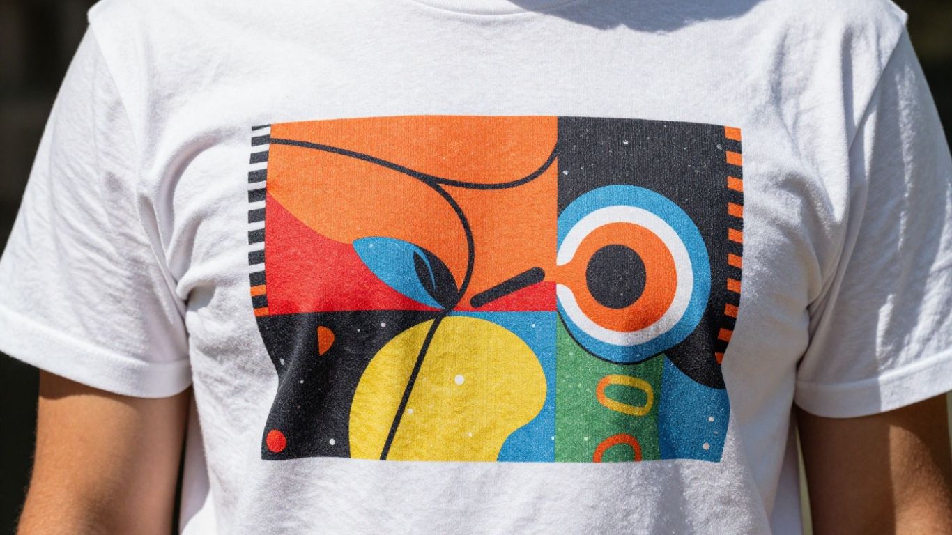
If you sell print on demand shirts, for example, a flat lay can work… but a model shot that looks natural often wins. Not always. But often. And yes, it depends on your niche.
2. Your photos should reduce anxiety, not just look pretty
Pretty is nice. But clarity sells.
A buyer has anxiety on Etsy because they can’t touch the product. So every photo should remove a specific doubt.
A high converting Etsy photo set (use this structure)
Try to build your images like this:
- Hero shot: the “I want this” image. Clean, clear, attractive.
- Close up: texture, print quality, material detail.
- Scale: show size on a person or in a real setting.
- Variations: colors, styles, options (and label them).
- What’s included: what exactly they get, especially for bundles.
- Sizing chart: simple, readable, not crammed.
- Shipping or process: “Made to order, ships in X days” (a simple graphic helps)
- Trust builder: a lifestyle image, packaging image, or review screenshot (if allowed and accurate)
For print on demand, the biggest conversion killers are:
- sizing confusion
- color confusion
- “will the print crack / peel?”
- “is this a cheap blank?”
- delivery timing
So your images should tackle those directly.
Also. Don’t make buyers zoom to read your size chart. If your size chart text is microscopic, it’s basically not there.
Mockups matter more than people admit
If your mockups look fake, shoppers feel risk. Risk lowers conversion.
If you’re scaling POD, you’ll probably lean on mockups heavily, which is fine. Just pick mockups that look like normal life. A wrinkled shirt in a real room beats a perfect floating shirt sometimes.
And if you want the workflow to be faster, this is where an automation tool can help.
NinjaSell, for example, is built for print on demand sellers who want to move quickly without sacrificing listing quality. You upload your designs, and it can automatically generate mockups and create optimized Etsy listings, then fulfill orders with white label shipping. The big win here is consistency. Your listings don’t end up half finished because you got tired after making mockup number six.
3. Titles: stop writing for the algorithm only. Write for the buyer first.
Yes, Etsy search needs keywords. But your title is also sales copy.
Bad title behavior:
- stuffing 12 keywords separated by commas
- repeating the same phrase 3 times
- leading with vague words like “Cute” or “Gift”
Better title behavior:
- lead with the exact product + the main keyword people actually type
- include the core personalization or niche phrase
- add a use case (gift for, occasion, recipient) if it’s relevant
A simple title template that converts
Primary keyword + product type + who it’s for + personalization/feature + occasion
Example for POD apparel:
- “Custom Family Vacation Shirt, Matching Beach Trip Tee, Personalized Names, Summer Group Shirt”
Don’t make it a poem. Make it obvious.
And keep the first 40-ish characters strong because that’s what people actually see on mobile.
4. Price is not just math. It’s positioning.
On Etsy, shoppers compare. Even if they don’t mean to.
If you’re priced higher, you need to justify it with:
- better photos
- clearer value
- better branding
- stronger reviews
- stronger guarantee and shipping clarity
If you’re priced lower, you need to avoid looking “cheap”. That’s a weird balance.
Practical pricing moves that help conversion
- Use psychological simplicity: $24.99 is fine. $24.73 feels strange.
- Offer a clear upsell: like “2 for $X” or bundle variants.
- Be careful with constant sales: Etsy shoppers are not dumb. If it’s always 50% off, it becomes your real price and can reduce trust.
And for POD specifically, make sure you are pricing with enough margin to handle:
- replacement orders
- refunds
- ad spend if you use Etsy Ads
Because conversion rate gains don’t matter if you’re losing money.
5. Shipping and delivery clarity is a conversion lever (especially for POD)
A lot of Etsy buyers are shopping for an event. They care about dates.
If your processing time is long, that’s not automatically a dealbreaker. Confusion is the dealbreaker.
Improve conversion by making delivery feel predictable
- Put processing time in the description near the top, not hidden.
- Include a simple delivery expectation image.
- If you offer upgrades, make them obvious.
- If you can, enable accurate delivery estimates.
If you use a system like NinjaSell that fulfills print on demand orders with white label shipping, your operational side can be smoother. Fewer late orders, fewer angry messages, better reviews. Reviews feed conversion. It’s all connected.
6. Descriptions: write for the skimmer, not the reader
Most buyers skim the first few lines, then scroll to reviews, then maybe come back.
So the top of your description is prime real estate.
A description structure that converts
Start with 5 to 8 short lines:
- What it is
- Who it’s for
- Key benefit
- How to order (especially if personalized)
- Production time
- Returns or replacements policy summary
- Anything that prevents confusion (digital vs physical, etc.)
Then go into details:
- materials, fit, sizing
- printing method (DTG, embroidery, etc if relevant)
- care instructions
- personalization fields
- disclaimers about color variation
And use simple formatting:
- short paragraphs
- bullet points
- occasional ALL CAPS for critical notes (don’t overdo it)
If your description is one giant block of text, you’re making the buyer work.
7. Variations and personalization: reduce decision fatigue
Decision fatigue kills conversion.
If you have 24 color options, 12 sizes, 3 shirt types, 4 sleeve lengths, and a personalization box… some buyers will bounce. Not because they hate choice. Because it feels risky to choose wrong.
Improve conversion by simplifying
- Only offer the options people actually buy.
- Put best sellers first (if Etsy allows ordering).
- Use the variation labels like a teacher, not like a coder. Write “Shirt Color” not “Color 1” and “Size (Unisex)” not “Option A”.
For personalization, be painfully specific:
- “Enter name exactly as you want printed. Example: ‘Sarah'”
- “If you want no name, type ‘No name'”
This reduces errors. Fewer errors equals fewer complaints and refunds. Which eventually bumps conversion too, because your shop reputation improves.
8. Reviews: you don’t control them, but you can engineer more of them
Reviews are one of the strongest conversion boosters on Etsy.
To get more reviews:
- deliver on time
- match the photos
- have accurate sizing guidance
- handle problems fast and politely
- include a small insert asking for a review (within Etsy policy)
For POD, one bad fit complaint can happen. That’s real life. But if your listing has clear sizing photos and you mention “measure a similar shirt you own”, you reduce review risk.
Also, reply to negative reviews calmly when it’s appropriate. Not defensive. Just professional. Future buyers read those replies.
9. Fix your tags and categories so Etsy sends the right traffic
Traffic quality affects conversion rate.
If you rank for broad keywords, you get broad shoppers. Broad shoppers browse and leave.
If you rank for specific intent keywords, you get buyers.
Simple tag strategy
- Use all tag slots.
- Avoid repeating the exact phrase across multiple tags.
- Mix product type tags (shirt, tote bag, poster), niche tags (teacher gift, hiking lover), occasion tags (birthday, bachelorette, new mom), and style tags (minimalist, retro, funny).
Also make sure:
- category is correct
- attributes are filled
- occasion and recipient attributes match your real buyer
This is not glamorous, but it’s how you get the right clicks.
10. Run a listing audit using your own Etsy data (not vibes)
Here’s a simple way to diagnose conversion problems.
Look at a listing with:
- high views, low sales
- lots of favorites, low sales
- add to carts, low sales
Interpretation
- High views, low sales: mismatch. Title or thumbnail attracts the wrong click, or price shocks them, or photos don’t reassure.
- Lots of favorites: “I like it but…” usually price, delivery time, or uncertainty about fit/size.
- Add to carts but no purchase: shipping cost surprise, delivery estimate too late, or they’re comparison shopping.
Make one change at a time, then give it time to breathe.
If you change title, photos, price, and description all at once, you won’t know what worked.
11. Use Etsy Ads as a conversion testing tool (carefully)
Etsy Ads can be useful, but don’t use ads to “force” a bad listing to sell.
Use ads like this:
- Pick 1 to 3 listings
- Set a small daily budget
- Run for a week
- Watch clicks, orders, and the search terms report (if available)
If you get clicks but no sales, it’s a listing issue. Not an ad issue.
12. Speed matters when you’re scaling, but quality can’t drop
If you’re doing print on demand, scaling usually means more designs and more listings.
The danger is you start rushing.
- Lazy mockups
- Generic descriptions
- Inconsistent titles
- Half filled attributes
And conversion drops. Quietly.
This is where a tool like NinjaSell can fit into the workflow.
The pitch is pretty straightforward: you upload your designs and it automatically creates optimized Etsy listings, generates mockups, and fulfills POD orders with white label shipping. So you can launch faster, and keep your listing structure consistent across dozens or hundreds of products.
Consistency is underrated. Etsy buyers don’t see your dashboard, but they feel consistency. It feels like a real shop, not a random listing.
Quick conversion checklist (save this, seriously)
If you want a fast audit, go down this list:
- Thumbnail clearly shows product and niche
- First photo is the strongest one, not a “details” photo
- 7 to 10 images total with sizing and variation clarity
- Title leads with primary keyword and product type
- Price matches market positioning and your photo quality
- Shipping cost is not a surprise
- Delivery expectations are clear
- Variations are simple and labeled clearly
- Personalization instructions prevent mistakes
- Description top section is skimmable and answers key questions
- Category, attributes, tags are accurate and specific
- Reviews are being generated through great fulfillment, not begging
Wrap up (what I’d do if I had to raise conversion this week)
If I had a week to improve Etsy listing conversion rates, I would not touch everything.
I’d do this, in order:
- Replace the first photo and rebuild the image set for clarity.
- Rewrite the first half of the title to match buyer intent.
- Add a clean sizing chart image and simplify variations.
- Rewrite the top of the description so it answers questions fast.
- Check shipping cost and delivery expectations so there are no surprises.
Then, if I’m scaling a POD store and I’m tired of doing the same setup work over and over, I’d look at automation like NinjaSell to keep listings optimized, mockups consistent, and fulfillment smooth with white label shipping.
Because at the end of the day, conversion rate is buyer confidence.
And buyer confidence is built in a hundred tiny moments on the listing page. You don’t need a new trick. You need fewer doubts.
FAQs (Frequently Asked Questions)
What is Etsy conversion rate and what numbers should I aim for?
Etsy conversion rate is the percentage of visits to your listing that turn into orders. For example, 1 sale per 100 visits equals a 1% conversion rate. Generally, 1% is considered ‘okay’, 2-3% is solid, and 4%+ indicates a very well-optimized listing with a strong niche or offer.
Why am I getting views and favorites on Etsy but no sales?
Most Etsy conversion issues stem from listing problems rather than traffic problems. If many people see your product but don’t buy, it likely means your listing isn’t effectively answering buyers’ questions about the product’s suitability, quality, price, or trustworthiness. Improving your photos, title, description, and policies can help boost sales.
How can I improve my Etsy listing’s first impression to increase conversion?
Focus on the ‘first 3 seconds’ elements: your main photo thumbnail should look clear and natural (not like a generic template), the first words of your title should immediately communicate what you’re selling, and your price and shipping info should be visible. Compare your listing to top sellers in your category to ensure yours fits in visually.
What kind of photos should I use on my Etsy listings to reduce buyer anxiety?
Use photos that not only look attractive but also reduce doubts buyers might have. A high-converting photo set includes a hero shot, close-up details, scale images showing size in real settings, variations with labels, exact contents of the package, readable sizing charts, shipping/process info graphics, and trust builders like lifestyle shots or packaging images.
How should I write my Etsy product titles for better conversions?
Write titles primarily for buyers instead of just stuffing keywords for the algorithm. Lead with the exact product name plus main keyword customers search for. Include personalization or niche phrases if relevant and add use cases like gift occasions or recipient types. Avoid vague words and repetitive keyword stuffing.
What are some common print-on-demand (POD) listing mistakes that hurt Etsy conversions?
Common POD mistakes include unclear sizing charts (too small to read), color confusion in photos, doubts about print quality (like cracking or peeling), uncertainty about blank apparel quality, and unclear delivery timing. Address these directly with clear images and descriptions to increase buyer confidence and conversions.