You can have a genuinely great design. Like, something you’d wear yourself. Clean typography, good color choices, the whole thing.
And then you upload it to Etsy, slap it on a random mockup, and suddenly it looks like a $7 shirt from a gas station bargain bin. Harsh, but you’ve seen it.
Mockups are doing more selling than most people realize. For POD especially. Because shoppers can’t touch the fabric, can’t feel the print, can’t try sizing. They’re basically buying the photo.
So if your mockup looks off, even slightly, the brain goes: “cheap.” And it doesn’t matter if your blank is a premium Bella Canvas or Comfort Colors. You still lose the click.
This post is a rundown of the most common mockup mistakes that quietly tank conversions and make a listing feel low quality. And how to fix them without turning into a Photoshop wizard.
1. The design is floating. No texture. No fabric. Just… pasted on
This is probably the biggest one.
When a design looks like a flat sticker laid on top of the shirt, shoppers clock it instantly. It screams “digital overlay.” Which then screams “this seller doesn’t really make this.”
Typical signs:
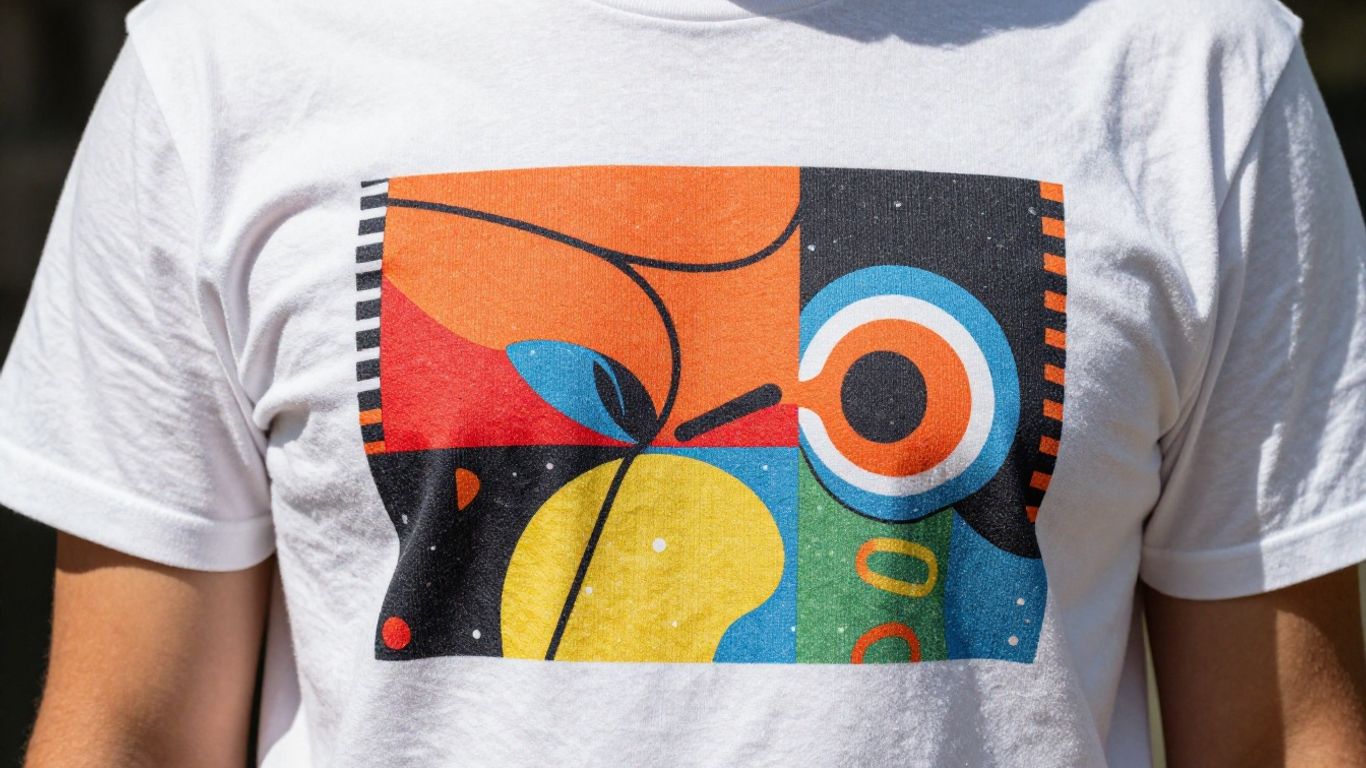
- The print ignores folds and wrinkles.
- The ink looks glossy or neon sharp.
- The edges are too crisp, like a PNG slapped on.
Fix:
- Use mockups that have realistic displacement (the print bends with the fabric).
- Add a tiny bit of grain or texture to the art so it sits in the shirt instead of hovering above it.
- Avoid mockups where the garment is perfectly flat with no lighting variation. Those make everything look fake.
2. Your design is the wrong size (either billboard huge or weirdly tiny)
This one is sneaky because you might think, “Bigger is better. More visible.”
But oversized prints on mockups often look like counterfeit merch. Especially if the design is pushing into seams or armpits. On the other side, tiny chest prints that look lost in the middle of the shirt feel like a mistake.
Common “cheap” sizing moments:
- The graphic is wider than the chest area on a fitted shirt.
- The design is centered too low and hits the belly area.
- Pocket-style designs placed dead center on the torso.
Fix:
- Stick to believable retail sizing.
- For standard tees: center chest designs typically look best when they sit a bit higher than you think.
- If you sell multiple garment types (unisex, women’s, youth), check sizing per mockup. One size does not fit all.
3. The mockup scene doesn’t match the vibe of the product
This is where things feel “off,” even if the mockup is technically high quality.
A snarky meme tee on a cozy neutral lifestyle background can feel like someone wearing a joke shirt to a pottery class. Or a minimalist quote on a loud, neon, streetwear mockup set.
Shoppers don’t just buy the shirt. They buy the identity around it.
Fix:
- Match scene to niche. Outdoorsy designs with outdoorsy settings. Elegant designs with clean, premium shots.
- Keep your shop consistent. If every listing looks like it came from a different universe, the shop feels random.
This is also why Etsy-style mockups tend to perform better on Etsy. They look native. Like they belong there.
If you want to save time here, platforms like NinjaSell generate Etsy-ready mockups and listings as a system, so you’re not cobbling together random templates and hoping it looks coherent.
For more insights on creating professional product photos that resonate with your brand’s identity and appeal to your target audience, consider exploring this comprehensive guide.
4. Lighting doesn’t match. The print is brighter than the sun
Ever seen a shirt mockup where the model is in warm, soft lighting… but the design is pure white and glowing like a backlit billboard?
That mismatch kills realism instantly. And realism is what makes POD feel legit.
Fix:
- Lower brightness and contrast on the design overlay.
- Warm up the design slightly if the photo is warm.
- Don’t use pure #FFFFFF white unless the mockup lighting supports it. Off-whites tend to look more natural.
5. Using the same exact mockup everyone else is using
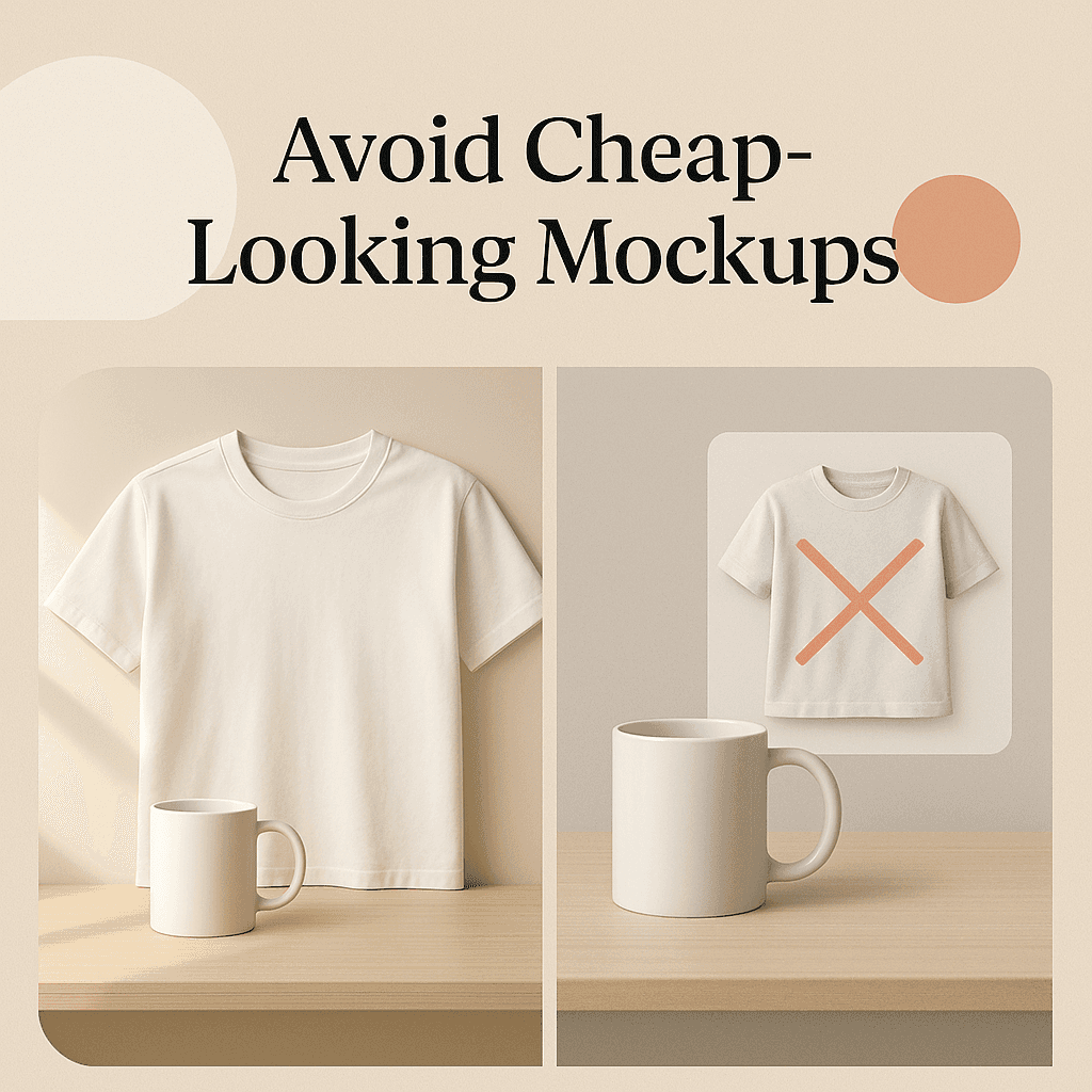
You know the one. The folded shirt on the white table with the same little plant and the same coffee mug. Or the model holding the shirt collar with both hands, looking down.
When shoppers see the same mockup across 12 listings from different sellers, it becomes “mass produced” in their mind. Even if you’re not mass producing. Even if your designs are original.
Fix:
- Mix mockup angles. Add at least one that feels different.
- Use a combo: one lifestyle, one close-up, one flat lay, one size/fit reference.
- If you can, rotate mockup sets every so often. Just to avoid template fatigue.
6. Not showing the back (or key details) when the design needs it
If you sell a back print, sleeve print, or anything placement-specific, and your mockups don’t show it clearly, shoppers assume it’s not there. Or worse, they assume you’re hiding something.
That uncertainty reads as low quality.
Fix:
- Include at least one back view if there’s anything on the back.
- Sleeve prints need a close-up angle, not a distant lifestyle shot.
- If your design is small, include a zoomed crop.
Even if you only add one extra image, it can lift trust a lot.
7. The garment color is unrealistic (and the design colors shift like crazy)
Color accuracy is hard. POD is not perfect. But mockups that look wildly off tend to get blamed on the seller.
If the shirt color in the mockup looks like a perfect pastel and the real blank is slightly different, returns and bad reviews happen. Also, bright neon designs on muted garment photos can look… cheap. Because it’s not believable.
Fix:
- Stick closer to real blank colors from your print provider.
- Don’t oversaturate the mockup image.
- Consider offering fewer colors if you can’t mock them accurately. Better to sell 5 confident options than 20 questionable ones.
8. Too much clutter in the frame
Props can help. But too many props make the product feel like an afterthought.
If your shirt is 20 percent of the image and everything else is candles, plants, mugs, pillows, and a laptop, it becomes a lifestyle stock photo. Not a product listing.
Fix:
- The product should be the hero.
- Use negative space. Let the design breathe.
- If you’re using a flat lay, keep props minimal and consistent.
It’s also important to ensure that color accuracy is maintained in your images. As noted in this discussion about color accuracy, even slight discrepancies can lead to misunderstandings about your product’s quality or appearance.
9. Wrong crop for Etsy (and the thumbnail gets murdered)
Etsy thumbnails are tiny. That’s reality. So if your mockup is zoomed out and the design is small, the listing looks like nothing.
This is one of the most expensive mistakes because it kills clicks before anyone even sees your title.
Fix:
- Test your thumbnail at small size. Literally zoom out on your screen until it’s tiny. Can you tell what it is?
- Use a closer crop for the first image. You can include wider lifestyle shots later in the carousel.
- Keep the design legible in the first image.
This is where automation can help a lot, because you’re not manually creating five crops per product. Tools like NinjaSell are built around making products Etsy-ready, including the visual side, so you’re not doing this repetitive stuff every day.
10. Showing impossible print quality (so the real product disappoints)
Some mockups make the print look like it has zero texture, perfect edge detail, and infinite resolution. It looks like screen printing on a luxury blank.
Then the buyer gets a standard DTG print, which is good, but it’s not that. And disappointment turns into reviews.
Fix:
- Use mockups that reflect realistic DTG texture.
- Avoid ultra-sharp “vector-perfect” looks on fabric.
- If you sell fine line art, consider mockups that show it honestly, and avoid shrinking the design too much.
11. Not enough images. Or all images are basically the same
Etsy allows multiple photos. Use them.
A cheap-looking listing often has:
- 1 mockup, maybe 2.
- Both are the same angle, same background, same crop.
- No scale reference.
- No close-up.
Fix: Aim for a simple set like:
- Primary: close front view (best thumbnail)
- Lifestyle: model shot for vibe
- Close-up: print texture / design detail
- Secondary angle: side or 3/4
- Back: if relevant
- Size chart: clean, readable
- Color options: simple grid (optional, but helpful)
You don’t need all of these for every listing. But the more your product needs explanation, the more images you should use.
For more insights on how to effectively use photography to enhance your Etsy listings, refer to this comprehensive guide on Etsy product photography.
12. The mockup looks like a scammy ad. Not an Etsy product
This is more of a “feel” thing.
Overly aggressive mockups, loud backgrounds, heavy filters, giant fake shadows, neon outlines. It can make a listing feel like it belongs on a random dropship site, not Etsy.
Etsy buyers tend to respond to calm, clear, honest visuals. Not always. But usually.
Fix:
- Go simpler.
- Reduce filters.
- Keep it natural. If the photo looks like a real person took it, you’re already ahead.
Before you publish, look at your first mockup and ask:
- Does the print follow the fabric folds?
- Is the design size believable?
- Does the lighting match the scene?
- Is the thumbnail readable?
- Does the mockup vibe match the niche?
- Do I show key placements (back, sleeve) if needed?
- Do the colors look real?
- Would I trust this listing if I saw it for the first time?
If you hesitate on more than one of these, fix the mockup before you touch anything else. Before SEO tweaks. Before new tags. Because none of that matters if the shopper doesn’t click.
Where NinjaSell fits in (without making your life more complicated)
If you’re doing POD on Etsy at any real volume, mockups become a grind. Same with writing titles, tags, descriptions, and keeping listings fresh.
That’s basically what NinjaSell is built for. You upload your design, it helps generate Etsy-style mockups, builds optimized listings based on trend and bestseller data, checks trademarks, and lets you publish to Etsy as drafts. No subscription fees, which is nice. You pay base and shipping when orders happen.
If you’re already spending hours on mockups alone, it’s worth at least looking at: https://ninjasell.com
Wrap up
POD doesn’t have to look cheap. But the mockup has to do its job.
Most “cheap” mockups aren’t actually low resolution or badly shot. They’re just… unconvincing. Wrong size. Wrong lighting. Wrong vibe. Too generic. Too fake.
Fix those few things and your products start feeling real. Like something someone actually sells. And that’s when the clicks go up. Which is the whole game on Etsy.
FAQs (Frequently Asked Questions)
Why do some great designs look cheap on Etsy mockups?
Even a genuinely great design can look cheap if the mockup is off. Mockups do more selling than most realize, especially for Print-On-Demand (POD), because shoppers buy the photo since they can’t touch or try the product. If the mockup looks slightly off—like a flat sticker pasted on the shirt or mismatched lighting—the brain perceives it as “cheap,” which harms clicks and conversions.
How can I avoid my design looking like a flat sticker on a shirt mockup?
To prevent your design from appearing as a flat sticker, use mockups with realistic displacement where the print bends with the fabric. Add subtle grain or texture to your artwork so it integrates into the shirt rather than hovering above it. Avoid perfectly flat garments with no lighting variation, as they make designs look fake.
What is the ideal size and placement for designs on shirt mockups?
Stick to believable retail sizing: avoid oversized prints that push into seams or armpits, which look counterfeit. Center chest designs generally look best when positioned slightly higher than you might expect. Also, ensure sizing is appropriate for each garment type (unisex, women’s, youth), as one size does not fit all.
How important is matching the mockup scene to my product’s vibe?
It’s crucial. The scene should align with your product’s identity—for example, outdoorsy designs in outdoor settings or elegant designs in clean, premium shots. Consistency across your shop matters; random or mismatched scenes can make listings feel low quality and incoherent.
What lighting considerations should I keep in mind for shirt mockups?
Ensure the print’s brightness and contrast match the overall photo lighting. Avoid prints that are too bright or glowing compared to soft, warm lighting of the model. Lower brightness and contrast on design overlays if needed, warm up colors slightly if the photo has warm tones, and avoid pure white (#FFFFFF) unless supported by lighting—off-whites tend to look more natural.
Why should I show back views or close-ups of sleeve prints in my mockups?
If your design includes back prints, sleeve prints, or specific placements, not showing them clearly leads shoppers to assume they’re missing or being hidden, which signals low quality. Include at least one back view and close-up angles for sleeve prints to build trust and clearly communicate your product’s details.